UbuntuWiki:Usplash/EdgyPropositions
| 文章出处: |
{{#if: | {{{2}}} | https://wiki.ubuntu.com/Usplash/EdgyPropositions }} |
| 点击翻译: |
English {{#ifexist: {{#if: UbuntuWiki:Usplash/EdgyPropositions | UbuntuWiki:Usplash/EdgyPropositions | {{#if: | :}}UbuntuWiki:Usplash/EdgyPropositions}}/af | • {{#if: UbuntuWiki:Usplash/EdgyPropositions|Afrikaans| [[::UbuntuWiki:Usplash/EdgyPropositions/af|Afrikaans]]}}|}} {{#ifexist: {{#if: UbuntuWiki:Usplash/EdgyPropositions | UbuntuWiki:Usplash/EdgyPropositions | {{#if: | :}}UbuntuWiki:Usplash/EdgyPropositions}}/ar | • {{#if: UbuntuWiki:Usplash/EdgyPropositions|العربية| [[::UbuntuWiki:Usplash/EdgyPropositions/ar|العربية]]}}|}} {{#ifexist: {{#if: UbuntuWiki:Usplash/EdgyPropositions | UbuntuWiki:Usplash/EdgyPropositions | {{#if: | :}}UbuntuWiki:Usplash/EdgyPropositions}}/az | • {{#if: UbuntuWiki:Usplash/EdgyPropositions|azərbaycanca| [[::UbuntuWiki:Usplash/EdgyPropositions/az|azərbaycanca]]}}|}} {{#ifexist: {{#if: UbuntuWiki:Usplash/EdgyPropositions | UbuntuWiki:Usplash/EdgyPropositions | {{#if: | :}}UbuntuWiki:Usplash/EdgyPropositions}}/bcc | • {{#if: UbuntuWiki:Usplash/EdgyPropositions|جهلسری بلوچی| [[::UbuntuWiki:Usplash/EdgyPropositions/bcc|جهلسری بلوچی]]}}|}} {{#ifexist: {{#if: UbuntuWiki:Usplash/EdgyPropositions | UbuntuWiki:Usplash/EdgyPropositions | {{#if: | :}}UbuntuWiki:Usplash/EdgyPropositions}}/bg | • {{#if: UbuntuWiki:Usplash/EdgyPropositions|български| [[::UbuntuWiki:Usplash/EdgyPropositions/bg|български]]}}|}} {{#ifexist: {{#if: UbuntuWiki:Usplash/EdgyPropositions | UbuntuWiki:Usplash/EdgyPropositions | {{#if: | :}}UbuntuWiki:Usplash/EdgyPropositions}}/br | • {{#if: UbuntuWiki:Usplash/EdgyPropositions|brezhoneg| [[::UbuntuWiki:Usplash/EdgyPropositions/br|brezhoneg]]}}|}} {{#ifexist: {{#if: UbuntuWiki:Usplash/EdgyPropositions | UbuntuWiki:Usplash/EdgyPropositions | {{#if: | :}}UbuntuWiki:Usplash/EdgyPropositions}}/ca | • {{#if: UbuntuWiki:Usplash/EdgyPropositions|català| [[::UbuntuWiki:Usplash/EdgyPropositions/ca|català]]}}|}} {{#ifexist: {{#if: UbuntuWiki:Usplash/EdgyPropositions | UbuntuWiki:Usplash/EdgyPropositions | {{#if: | :}}UbuntuWiki:Usplash/EdgyPropositions}}/cs | • {{#if: UbuntuWiki:Usplash/EdgyPropositions|čeština| [[::UbuntuWiki:Usplash/EdgyPropositions/cs|čeština]]}}|}} {{#ifexist: {{#if: UbuntuWiki:Usplash/EdgyPropositions | UbuntuWiki:Usplash/EdgyPropositions | {{#if: | :}}UbuntuWiki:Usplash/EdgyPropositions}}/de | • {{#if: UbuntuWiki:Usplash/EdgyPropositions|Deutsch| [[::UbuntuWiki:Usplash/EdgyPropositions/de|Deutsch]]}}|}} {{#ifexist: {{#if: UbuntuWiki:Usplash/EdgyPropositions | UbuntuWiki:Usplash/EdgyPropositions | {{#if: | :}}UbuntuWiki:Usplash/EdgyPropositions}}/el | • {{#if: UbuntuWiki:Usplash/EdgyPropositions|Ελληνικά| [[::UbuntuWiki:Usplash/EdgyPropositions/el|Ελληνικά]]}}|}} {{#ifexist: {{#if: UbuntuWiki:Usplash/EdgyPropositions | UbuntuWiki:Usplash/EdgyPropositions | {{#if: | :}}UbuntuWiki:Usplash/EdgyPropositions}}/es | • {{#if: UbuntuWiki:Usplash/EdgyPropositions|español| [[::UbuntuWiki:Usplash/EdgyPropositions/es|español]]}}|}} {{#ifexist: {{#if: UbuntuWiki:Usplash/EdgyPropositions | UbuntuWiki:Usplash/EdgyPropositions | {{#if: | :}}UbuntuWiki:Usplash/EdgyPropositions}}/fa | • {{#if: UbuntuWiki:Usplash/EdgyPropositions|فارسی| [[::UbuntuWiki:Usplash/EdgyPropositions/fa|فارسی]]}}|}} {{#ifexist: {{#if: UbuntuWiki:Usplash/EdgyPropositions | UbuntuWiki:Usplash/EdgyPropositions | {{#if: | :}}UbuntuWiki:Usplash/EdgyPropositions}}/fi | • {{#if: UbuntuWiki:Usplash/EdgyPropositions|suomi| [[::UbuntuWiki:Usplash/EdgyPropositions/fi|suomi]]}}|}} {{#ifexist: {{#if: UbuntuWiki:Usplash/EdgyPropositions | UbuntuWiki:Usplash/EdgyPropositions | {{#if: | :}}UbuntuWiki:Usplash/EdgyPropositions}}/fr | • {{#if: UbuntuWiki:Usplash/EdgyPropositions|français| [[::UbuntuWiki:Usplash/EdgyPropositions/fr|français]]}}|}} {{#ifexist: {{#if: UbuntuWiki:Usplash/EdgyPropositions | UbuntuWiki:Usplash/EdgyPropositions | {{#if: | :}}UbuntuWiki:Usplash/EdgyPropositions}}/gu | • {{#if: UbuntuWiki:Usplash/EdgyPropositions|ગુજરાતી| [[::UbuntuWiki:Usplash/EdgyPropositions/gu|ગુજરાતી]]}}|}} {{#ifexist: {{#if: UbuntuWiki:Usplash/EdgyPropositions | UbuntuWiki:Usplash/EdgyPropositions | {{#if: | :}}UbuntuWiki:Usplash/EdgyPropositions}}/he | • {{#if: UbuntuWiki:Usplash/EdgyPropositions|עברית| [[::UbuntuWiki:Usplash/EdgyPropositions/he|עברית]]}}|}} {{#ifexist: {{#if: UbuntuWiki:Usplash/EdgyPropositions | UbuntuWiki:Usplash/EdgyPropositions | {{#if: | :}}UbuntuWiki:Usplash/EdgyPropositions}}/hu | • {{#if: UbuntuWiki:Usplash/EdgyPropositions|magyar| [[::UbuntuWiki:Usplash/EdgyPropositions/hu|magyar]]}}|}} {{#ifexist: {{#if: UbuntuWiki:Usplash/EdgyPropositions | UbuntuWiki:Usplash/EdgyPropositions | {{#if: | :}}UbuntuWiki:Usplash/EdgyPropositions}}/id | • {{#if: UbuntuWiki:Usplash/EdgyPropositions|Bahasa Indonesia| [[::UbuntuWiki:Usplash/EdgyPropositions/id|Bahasa Indonesia]]}}|}} {{#ifexist: {{#if: UbuntuWiki:Usplash/EdgyPropositions | UbuntuWiki:Usplash/EdgyPropositions | {{#if: | :}}UbuntuWiki:Usplash/EdgyPropositions}}/it | • {{#if: UbuntuWiki:Usplash/EdgyPropositions|italiano| [[::UbuntuWiki:Usplash/EdgyPropositions/it|italiano]]}}|}} {{#ifexist: {{#if: UbuntuWiki:Usplash/EdgyPropositions | UbuntuWiki:Usplash/EdgyPropositions | {{#if: | :}}UbuntuWiki:Usplash/EdgyPropositions}}/ja | • {{#if: UbuntuWiki:Usplash/EdgyPropositions|日本語| [[::UbuntuWiki:Usplash/EdgyPropositions/ja|日本語]]}}|}} {{#ifexist: {{#if: UbuntuWiki:Usplash/EdgyPropositions | UbuntuWiki:Usplash/EdgyPropositions | {{#if: | :}}UbuntuWiki:Usplash/EdgyPropositions}}/ko | • {{#if: UbuntuWiki:Usplash/EdgyPropositions|한국어| [[::UbuntuWiki:Usplash/EdgyPropositions/ko|한국어]]}}|}} {{#ifexist: {{#if: UbuntuWiki:Usplash/EdgyPropositions | UbuntuWiki:Usplash/EdgyPropositions | {{#if: | :}}UbuntuWiki:Usplash/EdgyPropositions}}/ksh | • {{#if: UbuntuWiki:Usplash/EdgyPropositions|Ripoarisch| [[::UbuntuWiki:Usplash/EdgyPropositions/ksh|Ripoarisch]]}}|}} {{#ifexist: {{#if: UbuntuWiki:Usplash/EdgyPropositions | UbuntuWiki:Usplash/EdgyPropositions | {{#if: | :}}UbuntuWiki:Usplash/EdgyPropositions}}/mr | • {{#if: UbuntuWiki:Usplash/EdgyPropositions|मराठी| [[::UbuntuWiki:Usplash/EdgyPropositions/mr|मराठी]]}}|}} {{#ifexist: {{#if: UbuntuWiki:Usplash/EdgyPropositions | UbuntuWiki:Usplash/EdgyPropositions | {{#if: | :}}UbuntuWiki:Usplash/EdgyPropositions}}/ms | • {{#if: UbuntuWiki:Usplash/EdgyPropositions|Bahasa Melayu| [[::UbuntuWiki:Usplash/EdgyPropositions/ms|Bahasa Melayu]]}}|}} {{#ifexist: {{#if: UbuntuWiki:Usplash/EdgyPropositions | UbuntuWiki:Usplash/EdgyPropositions | {{#if: | :}}UbuntuWiki:Usplash/EdgyPropositions}}/nl | • {{#if: UbuntuWiki:Usplash/EdgyPropositions|Nederlands| [[::UbuntuWiki:Usplash/EdgyPropositions/nl|Nederlands]]}}|}} {{#ifexist: {{#if: UbuntuWiki:Usplash/EdgyPropositions | UbuntuWiki:Usplash/EdgyPropositions | {{#if: | :}}UbuntuWiki:Usplash/EdgyPropositions}}/no | • {{#if: UbuntuWiki:Usplash/EdgyPropositions|norsk| [[::UbuntuWiki:Usplash/EdgyPropositions/no|norsk]]}}|}} {{#ifexist: {{#if: UbuntuWiki:Usplash/EdgyPropositions | UbuntuWiki:Usplash/EdgyPropositions | {{#if: | :}}UbuntuWiki:Usplash/EdgyPropositions}}/oc | • {{#if: UbuntuWiki:Usplash/EdgyPropositions|occitan| [[::UbuntuWiki:Usplash/EdgyPropositions/oc|occitan]]}}|}} {{#ifexist: {{#if: UbuntuWiki:Usplash/EdgyPropositions | UbuntuWiki:Usplash/EdgyPropositions | {{#if: | :}}UbuntuWiki:Usplash/EdgyPropositions}}/pl | • {{#if: UbuntuWiki:Usplash/EdgyPropositions|polski| [[::UbuntuWiki:Usplash/EdgyPropositions/pl|polski]]}}|}} {{#ifexist: {{#if: UbuntuWiki:Usplash/EdgyPropositions | UbuntuWiki:Usplash/EdgyPropositions | {{#if: | :}}UbuntuWiki:Usplash/EdgyPropositions}}/pt | • {{#if: UbuntuWiki:Usplash/EdgyPropositions|português| [[::UbuntuWiki:Usplash/EdgyPropositions/pt|português]]}}|}} {{#ifexist: {{#if: UbuntuWiki:Usplash/EdgyPropositions | UbuntuWiki:Usplash/EdgyPropositions | {{#if: | :}}UbuntuWiki:Usplash/EdgyPropositions}}/ro | • {{#if: UbuntuWiki:Usplash/EdgyPropositions|română| [[::UbuntuWiki:Usplash/EdgyPropositions/ro|română]]}}|}} {{#ifexist: {{#if: UbuntuWiki:Usplash/EdgyPropositions | UbuntuWiki:Usplash/EdgyPropositions | {{#if: | :}}UbuntuWiki:Usplash/EdgyPropositions}}/ru | • {{#if: UbuntuWiki:Usplash/EdgyPropositions|русский| [[::UbuntuWiki:Usplash/EdgyPropositions/ru|русский]]}}|}} {{#ifexist: {{#if: UbuntuWiki:Usplash/EdgyPropositions | UbuntuWiki:Usplash/EdgyPropositions | {{#if: | :}}UbuntuWiki:Usplash/EdgyPropositions}}/si | • {{#if: UbuntuWiki:Usplash/EdgyPropositions|සිංහල| [[::UbuntuWiki:Usplash/EdgyPropositions/si|සිංහල]]}}|}} {{#ifexist: {{#if: UbuntuWiki:Usplash/EdgyPropositions | UbuntuWiki:Usplash/EdgyPropositions | {{#if: | :}}UbuntuWiki:Usplash/EdgyPropositions}}/sq | • {{#if: UbuntuWiki:Usplash/EdgyPropositions|shqip| [[::UbuntuWiki:Usplash/EdgyPropositions/sq|shqip]]}}|}} {{#ifexist: {{#if: UbuntuWiki:Usplash/EdgyPropositions | UbuntuWiki:Usplash/EdgyPropositions | {{#if: | :}}UbuntuWiki:Usplash/EdgyPropositions}}/sr | • {{#if: UbuntuWiki:Usplash/EdgyPropositions|српски / srpski| [[::UbuntuWiki:Usplash/EdgyPropositions/sr|српски / srpski]]}}|}} {{#ifexist: {{#if: UbuntuWiki:Usplash/EdgyPropositions | UbuntuWiki:Usplash/EdgyPropositions | {{#if: | :}}UbuntuWiki:Usplash/EdgyPropositions}}/sv | • {{#if: UbuntuWiki:Usplash/EdgyPropositions|svenska| [[::UbuntuWiki:Usplash/EdgyPropositions/sv|svenska]]}}|}} {{#ifexist: {{#if: UbuntuWiki:Usplash/EdgyPropositions | UbuntuWiki:Usplash/EdgyPropositions | {{#if: | :}}UbuntuWiki:Usplash/EdgyPropositions}}/th | • {{#if: UbuntuWiki:Usplash/EdgyPropositions|ไทย| [[::UbuntuWiki:Usplash/EdgyPropositions/th|ไทย]]}}|}} {{#ifexist: {{#if: UbuntuWiki:Usplash/EdgyPropositions | UbuntuWiki:Usplash/EdgyPropositions | {{#if: | :}}UbuntuWiki:Usplash/EdgyPropositions}}/tr | • {{#if: UbuntuWiki:Usplash/EdgyPropositions|Türkçe| [[::UbuntuWiki:Usplash/EdgyPropositions/tr|Türkçe]]}}|}} {{#ifexist: {{#if: UbuntuWiki:Usplash/EdgyPropositions | UbuntuWiki:Usplash/EdgyPropositions | {{#if: | :}}UbuntuWiki:Usplash/EdgyPropositions}}/vi | • {{#if: UbuntuWiki:Usplash/EdgyPropositions|Tiếng Việt| [[::UbuntuWiki:Usplash/EdgyPropositions/vi|Tiếng Việt]]}}|}} {{#ifexist: {{#if: UbuntuWiki:Usplash/EdgyPropositions | UbuntuWiki:Usplash/EdgyPropositions | {{#if: | :}}UbuntuWiki:Usplash/EdgyPropositions}}/yue | • {{#if: UbuntuWiki:Usplash/EdgyPropositions|粵語| [[::UbuntuWiki:Usplash/EdgyPropositions/yue|粵語]]}}|}} {{#ifexist: {{#if: UbuntuWiki:Usplash/EdgyPropositions | UbuntuWiki:Usplash/EdgyPropositions | {{#if: | :}}UbuntuWiki:Usplash/EdgyPropositions}}/zh | • {{#if: UbuntuWiki:Usplash/EdgyPropositions|中文| [[::UbuntuWiki:Usplash/EdgyPropositions/zh|中文]]}}|}} {{#ifexist: {{#if: UbuntuWiki:Usplash/EdgyPropositions | UbuntuWiki:Usplash/EdgyPropositions | {{#if: | :}}UbuntuWiki:Usplash/EdgyPropositions}}/zh-hans | • {{#if: UbuntuWiki:Usplash/EdgyPropositions|中文(简体)| [[::UbuntuWiki:Usplash/EdgyPropositions/zh-hans|中文(简体)]]}}|}} {{#ifexist: {{#if: UbuntuWiki:Usplash/EdgyPropositions | UbuntuWiki:Usplash/EdgyPropositions | {{#if: | :}}UbuntuWiki:Usplash/EdgyPropositions}}/zh-hant | • {{#if: UbuntuWiki:Usplash/EdgyPropositions|中文(繁體)| [[::UbuntuWiki:Usplash/EdgyPropositions/zh-hant|中文(繁體)]]}}|}} |
{{#ifeq:UbuntuWiki:Usplash/EdgyPropositions|:UbuntuWiki:Usplash/EdgyPropositions|请不要直接编辑翻译本页,本页将定期与来源同步。}} |
{{#ifexist: :UbuntuWiki:Usplash/EdgyPropositions/zh | | {{#ifexist: UbuntuWiki:Usplash/EdgyPropositions/zh | | {{#ifeq: {{#titleparts:UbuntuWiki:Usplash/EdgyPropositions|1|-1|}} | zh | | }} }} }} {{#ifeq: {{#titleparts:UbuntuWiki:Usplash/EdgyPropositions|1|-1|}} | zh | | }}
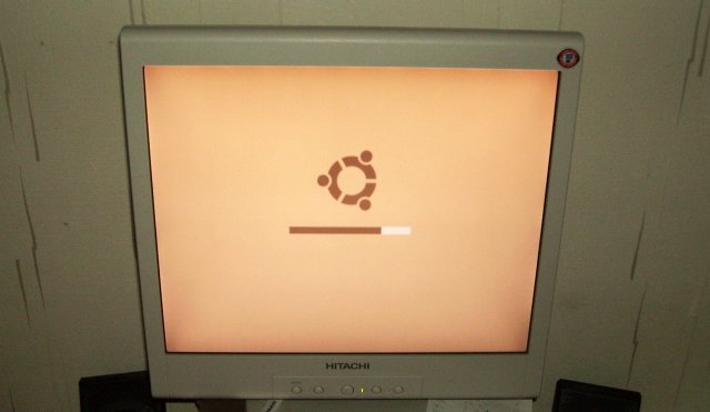
This page is meant to act as central repository for propositions for usplash to appear in Edgy Eft. Please list your propositions here. Once a reasonable amount of possible roadmaps have been created, we should have a vote on it. Keep a close watch on this page and the ubuntu-devel mailing list for more information!
NOTE: propositions for Dapper Drake (that consist of just a different splash screen) should be posted in UbuntuWiki:Usplash/DapperPropositions.
Propositions
Proposal by Michiel3/Omeg
I believe that the current usplash setup is fish nor fowl. It is possible that, for the common user, there is no need to display what is going on "behind the scenes" of the system that prominently during startup. I believe that the logging text should be removed in favor of a more graphically interesting usplash that is also more consistent with the default user interface inside of X. This change cannot be done before Dapper, as we're long past UI freeze, but might be nice to include in Edgy.
This proposal, I think, is a great way of retaining the clear distinction that there is between the "backbone" of the operating system and the "inner" warmth of the user interface. There is definitely a difference between the startup and shutdown processes and the actual interface that people are in once their machines are started up, and the black boot screen with human colors highlights that. It also has a manually pixeled progress bar that corresponds with the reflection in the usplash 0.1 logo. See also: MichielSuggestion
My proposal is as follows:
- Remove the text that shows what is going on "behind the scenes" of the operating system starting up or shutting down.
- Add a message that says either "System is starting up..." or "System is shutting down..." above the progress bar, exactly as written here, without quote characters.
- Reposition the elements on the screen in order to take full advantage of the room provided by the fact there is no longer any text.
- Update the visuals of the usplash to better integrate with the system's nice user interface. This includes:
- A new progress bar that consists of 4 images:
- A dark underlying progress bar with reflection:

- A bright overlapping progress bar with more simple reflection:

- A small image (8px x 10px) to be placed at the right side of the bright progress bar to handle the transition from bright reflection to dark reflection:
 - It's placed at the right side of the bright progress bar, at the same height as the reflection, minus 6 px on the x axis. The last 3 px are only shown after the progress bar reaches 100%; they are hidden otherwise.
- A dark underlying progress bar with reflection:
- Some examples:
1. (At 0%):1. (At 50%):
1. (At 100%):

All images are manually tuned to the pixel and use only 16 colors (15, actually, since one color was originally a shade of red used for the "fail" text). If anybody thinks that this would be nice, I'll put down how exactly it works in more detail and provide an example with ActionScript.
Note: I used a logo image which hasn't been compensated for the screen stretching of 640x400 yet.
Minimalist proposal
Found this one in the forums and it has been received well. Personally, I believe the simplicity is wonderful, but could be tweaked and cleaned. -- added Tuesday, 16 May 2006 by troy dot sobotka at gmail period com.
Keybuk's Proposal
This goes even simpler than the above proposal; it keeps the black background so that it looks good no matter the hardware, and just shows the Ubuntu logo as does the minimalist one.
A progress bar may not be useful in edgy, where the boot might be largely continuing under gdm with no consistent "100%" mark, so this replaces it with a "throbber" instead.

The progress bar should be at 100% as gdm starts up, as this is the time, the user needs to wait. It isn't interesting for him, that there's still some action behind, but it's very interesting, how long he needs to wait. -- KaiFLahmann2 DateTime(2006-05-30T01:39:24Z)
Alec Wright's Proposal
I don't think that there should be one single usplash. You should be able to select usplashes from a list, and download additional ones off of the internet. Usplash should be given a more user-friendly name, like booting screen, so that the computer illiterates can understand. There should be a "Select booting screen" thing in the preferences menu. Here's my idea for a usplash: really simple, just a spinning circle of friends.
Simon80's comment
I like the above idea of giving the user the means to easily change the bootsplash. I also very strongly disagree with getting rid of the text and progress bar, as it is the only feedback that the user gets with regards to boot progress. Contrary to what others are saying, having a progress bar that doesn't move at a constant speed is much better than no bar at all. Boot progress is a much more fine grained process than getting a 404 back in IE, so I don't think that that analogy is relevant here.
/!\ Edit conflict - other version: ----
Simon80's comment
I like the above idea of giving the user the means to easily change the bootsplash. I also very strongly disagree with getting rid of the text and progress bar, as it is the only feedback that the user gets with regards to boot progress. Contrary to what others are saying, having a progress bar that doesn't move at a constant speed is much better than no bar at all. Boot progress is a much more fine grained process than getting a 404 back in IE, so I don't think that that analogy is relevant here. I don't think it is reasonable to alienate the users that want a useful splash in favour of the ones who want a simple splash, in this particular case the user doesn't gain anything from the simplicity, since the splash is not interactive.
/!\ Edit conflict - your version: ----
/!\ End of edit conflict ----
Warbo's Proposal
I think that the progress bar should go, mainly because it does not move at a regular speed (at least on the few systems I have used Ubuntu on) which makes it quite useless. This is the same reason we have the bouncing-back-and-forth bar as well as the progress bar in application that have no idea how long they will take, like activating a device with DHCP (I know one of the most infuriating things about Internet Explorer is it's progress bar, since connecting to a site which doesn't exist can take ages to fill the first few pixels of the progress bar, then it instantly jumps to 100% with a 404 page). A "throbber" type animation could be used, probably a circle of fading dots that is familiar from Firefox and the busy cursor (bouncing progress bars are in effect the same thing).
My main idea, however, is to keep the user informed of what is going on, since they may wonder why the bootup is taking a while. I like the idea that Gentoo uses, with images appearing for each task (kind of like GNOME's splash screen) so maybe this could be implemented. I have made a basic mockup of what I am thinking here.